Friday, 11 March 2011
Foundation Portfolio Evaluation: Question 7. Looking back at your preliminary task, what do you feel you have learnt in the progression from it to the full product? (11.03.11)
Looking back on our preliminary task, I feel that I have learnt so much about producing your own piece of work. During the progression of that task, to our opening sequence I learnt that it is harder to produce something that looks good, more than what I thought it was. This is because it's easy to visualise something in your head, but it's hard to bring that to life, and put it in a piece, making it look effective and good. In our prelim task we learnt the match on action rule, the 180 degree rule, and shot reverse shot. We was then able to take on this knowledge when producing our opening sequence, and apply it to our footage we used in this. Now we have our full finished product, I have learnt that while producing a media piece, like ours, you need to make sure you set objectives to reach your final goal. These objectives need to be specific, measurable, achievable, realistic, and timed. This is so that you can organise, and plan out work that needs to be done to get to your final piece i.e our opening sequence. For our opening sequence, we needed to make sure that we measured and timed ourselves because we had a certain period of time to film all our footage, then a certain period of time to edit all our footage and get our final piece complete. We needed to set ourselves a piece of work we could achieve that would be specific, attainable and realistic, so that we weren't trying to produce something that was impossible.
Tuesday, 8 March 2011
Foundation Portfolio Evaluation: Question 6. What have you learnt about technologies from the process of constructing this product?
 Here is a mobile phone. We all used our phones to communicate with each other when we needed to film or meet up.
 Here is the blogger webpage. We used this to update and record all of our work. It enabled us to show work we have done and helped us to keep up-to-date with what we were doing.
 Here is the iMac which was the computer we use in media, and the only one we used to import all our footage on, and create our opening sequence. we had a group login on one specific iMac which stored all our groups work on it.
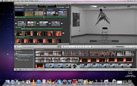
 Here is iMovie, which is the programme we used to create our opening sequence. We uploaded all our footage, created our effects, transitions, and edited everything in iMovie.
  Here is iTunes which is where we imported our music we used in our opening sequence. We originally got our music from youtube, and then downloaded it from youtube to mp3, and then into iTunes.
  Here is the programme LiveType, which we used when trying to create a piece of animated text, for our title.
 Here is SurveyMonkey, which we used to create our audience feedback survey. to get feedback from our opening sequence.
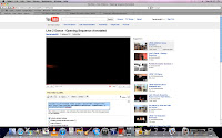
  Here is YouTube, which we used when researching films with dance genres before we made our oepening sequence.
 Monday, 7 March 2011
Foundation Portfolio Evaluation: Question 4. Who would be the audience for your media product? (07.03.11)
Here is someone who fits the appearance of our typical target audience. They would be interested in music and dance and likely to have dance as a hobby or enjoy watching it as entertainment. Our target audience is teenage girls and boys, however is most likely to attract the boys because of the violence involved, which is why i have chosen to draw a teenage boy.
Foundation Portfolio Evaluation: Question 2. How does your media product represent particular social groups? (28.02.11)
In our opening sequence, our media group represent particular social groups in different ways. Our opening sequence aims to set the conventions of a dance genre film, and engage our audience to make them interested in the film and want to watch more. We portray our male characters in a violent nasty way to tackle the stereotype of dancers working well as a team. This emphasises that not everything in life is as easy as it seems, and although we follow many of the conventions of a dance genre, we adapt our storyline to show the dancers are not friendly characters and are not able to work together. We represent our dancers as of a low social status group because the whole reason they are dancing is because they need the money. This means they are not doing it out of passion or love for dance, but for financial reasons, and are therefore undertaking and activity because they need to not because they want to. This re-enforces that they are of a low social group. The first image is from our opening sequence and resembles the shot from Step Up 2, showing aggressive behaviour between boys. The second image is from Step Up 2 and shows the aggressive behaviour between boys.
Foundation Portfolio Evaluation: Question 1. In what way does your media product use, describe or challenge forms and conventions of real media products i.e. film openings. (28.02.11)
Text colour: This image is from Step Up 2 and shows the colour black and white to be used together on their titles. This highlights darkness through the colour black, and danger through the colour red. This feel of 'danger' therefore reinforces competition and battle between competitors.
Text font and style: This image is from Street Dance 3D. We chose this shot because it shows the same style of font we used on our text for our opening sequence. The font used is a common handwriting font which illustrates quick free writing, which emphasises the mood of the 'Streets' where graffiti is seen.
Setting and location: This image is from Step Up 3 and demonstrates setting well because the boy is dancing outside with everyone around him. The location of the university is set at the same time, and this introduces the scene well.
Costume: This image is from Step Up 2 and shows the characters costume close-up, so the audience can clearly see what the characters are wearing. They show them wearing baggy clothes, which are suitable to dance in, which then emphasis the fact that its a dance film.
Colour adjustment: This image is from Dirty Dancing and shows that they have edited the colour adjustment of the footage, as it is in black and white. This makes it seem like a past moment, or gives the idea that it is set in the past.
Lighting: This image is from Street Dance 3D and shows the red and blue lighting is used during their dance performance. This lighting used emphasises the performance and the fact that there is a show on stage, taking place and makes it seem more professional.
Transitions: This image is from Step Up 2 and shows the transition of the text, 'fading to black'. This shows that time is moving on because the moving to black sets another scene, and gives a sense of passing time.
Genre suggestion: This image is from Honey and shows a group of people dancing on stage. This gives the genre suggestion of dance because it shows the characters dancing. So therefore suits the ocnventions of a dance genre film.
Title: This image shows our title which appears at the beginning of our opening sequence. Here we follow the conventions of a dance genre film, as you can see from the above image that dance films generally use the word 'dance' or 'dancing' in their title, and so have we.
Text colour: This image shows that we have used the same text colours as dance genre films use. This is black and red, and we have followed the conventions of dance genre films in their use of colour on text.
Text font and style: This image shows that we have adapted the font style that is usually seen in dance genre films, but have kept to the similar sort of font. This is because we wanted to stick to as much of the conventions as we could, the conventions that were basic and the ones which emphasised what genre film it was.
Setting and location: This image shows that we have taken on the convention of setting because we show our characters dancing outside. However, we have challenged the convention in the way that it is only one character on screen at a time, and that it isn't in a park or the streets, but just shows that he is outside.
Costume: This image shows characters in dance clothes, which again sticks to the conventions of a dance genre film. through costume.
Colour adjustment: This image shows that we have adjusted our colour to make the footage black and white for selected footage. We did this to show past moments, before we brought the action back to the present. We stuck to the colour conventions of a dance genre film by adjusting the colour to black and white.
Lighting: This image shows that we have used red lighting when our characters are performing their dance piece on stage. This does and doesn't stick to the conventions of a dance genre film because we have used the red lighting, but not the blue, which is used just as much.
Transitions: This image shows our transitions of fade to white. This is similar to the transitions that a dance genre film uses, because it is a simple transition. However we have used white more than black, which black is used more. Although, white is still commonly used in dance films.
Genre suggestion: Finally, this image again re-inforces that our opening sequence is for a dance genre film, because it follows the conventions that our characters are dancing at a show.
Overall, we have used and stuck to the conventions of a dance genre film, however we have challenged a few of the conventions here and there to make our work unique and challenge our skills.
Overall, we have used and stuck to the conventions of a dance genre film, however we have challenged a few of the conventions here and there to make our work unique and challenge our skills.
Tuesday, 1 March 2011
Subscribe to:
Comments (Atom)


